Just a short post, this is the revised print that I posted on Easter, link, this time with the second color. I’m hooked, if reduction relief did not work for me, individual color plates do. A certain obsessive compulsive inclination is satisfied by working each plate meticulously so that the image aligns. This is by no means a perfect print, the alignment is most noticeably askew when looking at the Princess’ upward reaching hand. But now I have a better grasp on the process and feel confident enough to work with more color, quite a relief -lame printmaking pun intended.

Strange Fruit, II
relief print on paper
I am attending a Mesoamerican conference this week in LA, I’m very excited, two days of Meso fun. Starting off with a workshop deciphering Mayan glyphs, I haven’t great expectations, but if I can recognize just a few glyphs I will be pleased. The spouse has arranged a vacation in Mexico City for the Day of the Day festival ; I’m eager to check out the museums and the ruins, planning a trip to Teotihuacan as well.

Until next time, take care,
LG

wow! the red layer adds a whole world to the print! i especially like that only his head is red, but the details and drips are also fantastic… awesome!
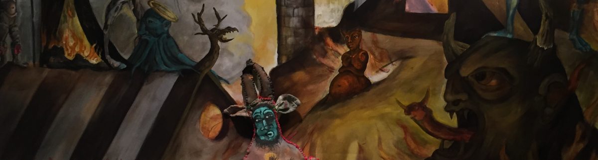
Thank you my friend, I’m happy you like the colored head. I was aiming for dream state and I think this image is beginning to capture that misty place.
A little mis-alignment is not a bad thing. People get too anal about perfect alignment, and the enlivening spirit can be lost in the process. I really like the down-and-dirty, gritty energy that comes from imperfect pressure and slips of alignment. I prefer the tradition of chapbooks and folk-prints to when artists get all precious about printing. Don’t get more interested in perfecting things than using them to express yourself robustly. This print is looking great.
You might try pochoir, the technique of making stencils to add colour to relief prints. That’s the way I made the two-colour print for the cover of ‘Witch.’ Didn’t have time to cut another block, and so I made a paper stencil, stippled the red through it and then printed from the single lino-block inked with black. Really fast and looks great:
http://clivehicksjenkins.wordpress.com/2012/04/28/witch-3/
Absolutely , misalignment is part of the mediums charm . But right now I really am eager to learn proper technique. But aesthetically we are in complete agreement . I know of the stenciling technique , but wasn’t aware of its name, so thank you for that . The German Expressionist seemed to make great use of that practice. But again , for now, my assignments are to create a ” proper” series ; evidently stenciling doesn’t assure precise duplication . I know this sounds terribly fastidious , my instructor is a very fine yet orthodox printmaker . I don’t plan on being that orthodox , printmaking for me is a means to an end , but I do want to master the technique . This country is full of dilettantes , I want to be able to know I at least have mastered basics.
Thanking you as always for your wisdom and support . Love, LG
What a powerful image, the slight misalignment gives it even more of a buzz for me – it packs a punch but is mysterious as well, you look very at home in this medium!
Thank you my friend, I’m enjoying the medium , a happy break between painting .