As I countdown to my Fairyland opening February 23rd I have been working on marketing projects . Postcard being my anachronistic focus . While social media invitations and digital marketing will be made by my publicist, I have a deep fondness for paper ephemera.
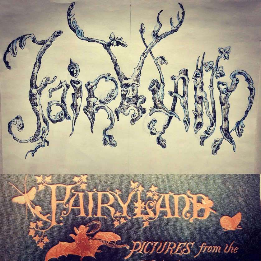
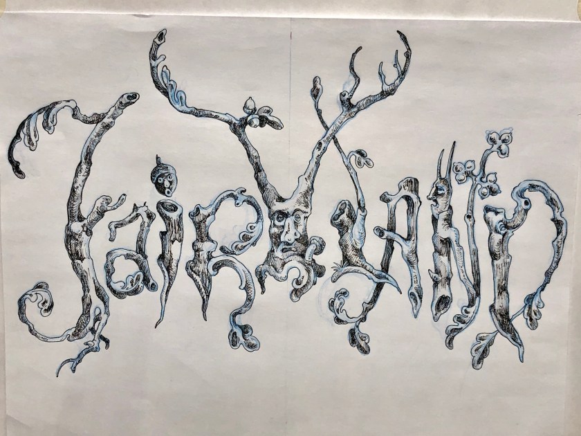
In designing the postcards I found I needed a font for the word Fairyland. The fonts that seemed vaguely suitable were of that whimsical nostalgic mid- century sort – the sort of things that make me cringe . The Black Forest , Olde World, “Gothick” fonts seemed silly and a bit too Renaissance Fair(e).
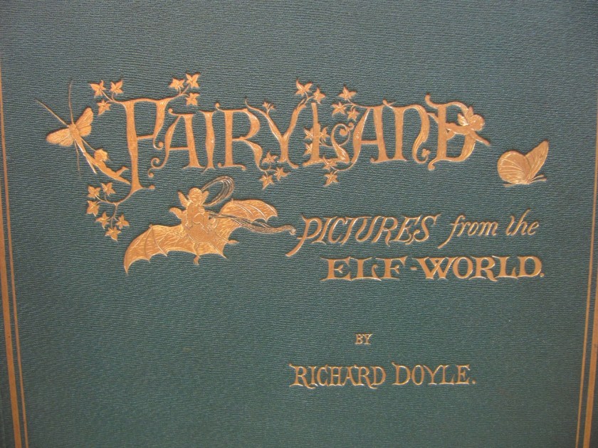
At a loss I then recalled my hero , the Victorian illustrator Richard Doyle who in 1870 had published his own Fairyland. I knew he had designed the cover himself, I have always admired that, his insistence upon visual continuity, in fact his Fairyland is in some ways an inspiration for my own . So with his example in mind , I decided to design one myself.

While Doyle’s is adorable and sweet and my own gnarled and encrusted, I feel kinship between the two.

(The bat being perfect .)
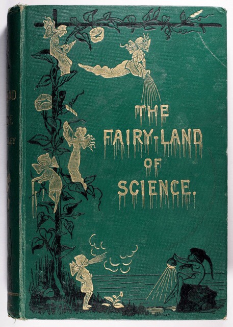
In researching fairies and fairyland themes , I turned to late 19th century sources which seemed obsessed with the theme . As this charming cover attests , even dour science could be sprinkled with fairy dust .

My own fairies aren’t as innocent perhaps but I think just as cute.

( note the tedious font )
In addition to Doyle’s wonderful art , work that I’ve enjoyed since boyhood, another childish delight has been the illustrations of the D’Aulaires. Frequently whimsical but never silly their book art has long been a favorites day an inspiration . Their Trolls had particularly enchanting title font , it is a wonderful book , full of creepy , funny , stupid , hilarious trolls ( and comely humans ).

The inspiration has been broad and wide , from medieval illumination, to Victorian book art; I’ve had much to admire . In the end I’m satisfied with my own lettering , I may either have it translated into vinyl lettering or if time allows paint it directly upon the gallery walls myself .

With that , welcome to Fairyland.


