
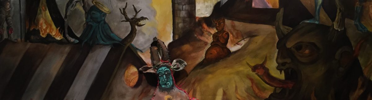
2018
Mixed media, acrylic painted canvas, recycled fiber, embroidery floss, poly-fil
63 by 36 by 32 inches


As I countdown to my Fairyland opening February 23rd I have been working on marketing projects . Postcard being my anachronistic focus . While social media invitations and digital marketing will be made by my publicist, I have a deep fondness for paper ephemera.
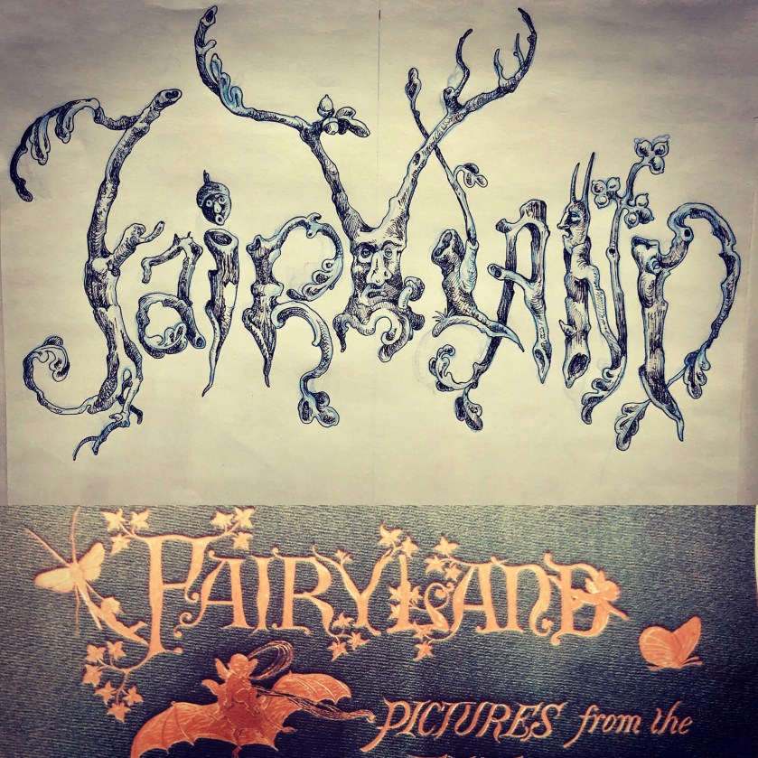
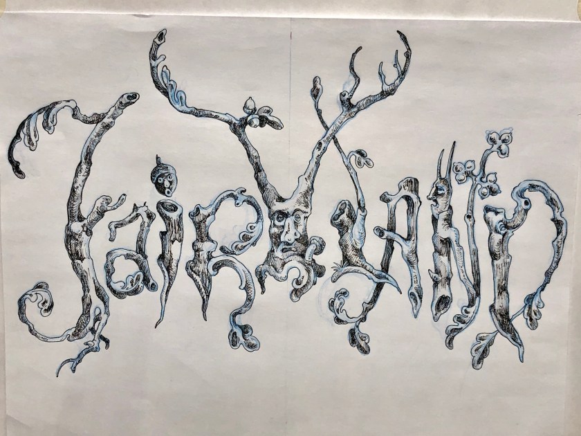
In designing the postcards I found I needed a font for the word Fairyland. The fonts that seemed vaguely suitable were of that whimsical nostalgic mid- century sort – the sort of things that make me cringe . The Black Forest , Olde World, “Gothick” fonts seemed silly and a bit too Renaissance Fair(e).
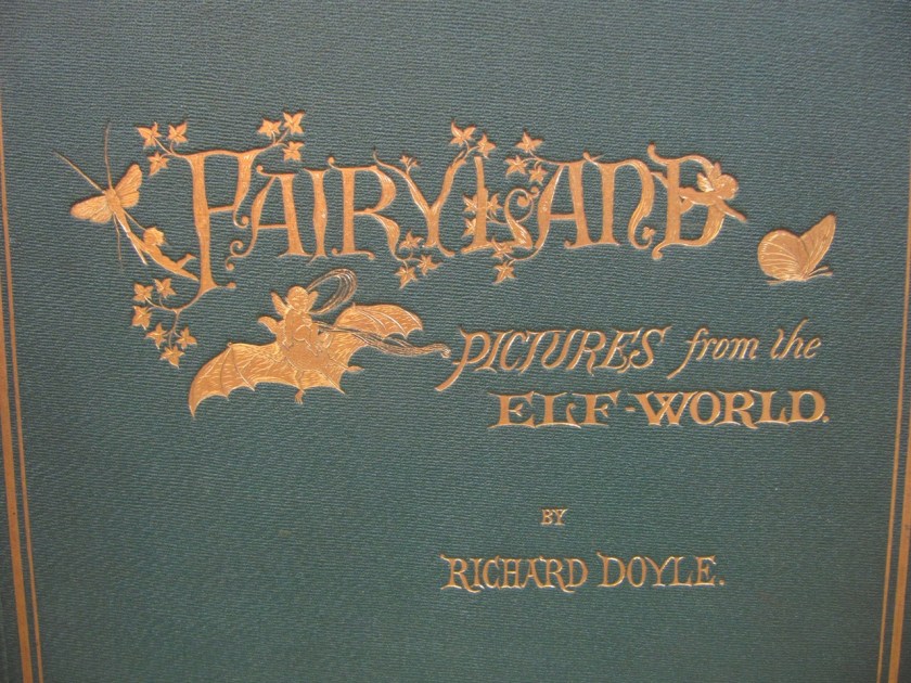
At a loss I then recalled my hero , the Victorian illustrator Richard Doyle who in 1870 had published his own Fairyland. I knew he had designed the cover himself, I have always admired that, his insistence upon visual continuity, in fact his Fairyland is in some ways an inspiration for my own . So with his example in mind , I decided to design one myself.

While Doyle’s is adorable and sweet and my own gnarled and encrusted, I feel kinship between the two.
(The bat being perfect .)
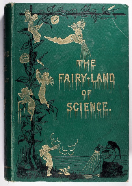
In researching fairies and fairyland themes , I turned to late 19th century sources which seemed obsessed with the theme . As this charming cover attests , even dour science could be sprinkled with fairy dust .
My own fairies aren’t as innocent perhaps but I think just as cute.

( note the tedious font )
In addition to Doyle’s wonderful art , work that I’ve enjoyed since boyhood, another childish delight has been the illustrations of the D’Aulaires. Frequently whimsical but never silly their book art has long been a favorites day an inspiration . Their Trolls had particularly enchanting title font , it is a wonderful book , full of creepy , funny , stupid , hilarious trolls ( and comely humans ).

The inspiration has been broad and wide , from medieval illumination, to Victorian book art; I’ve had much to admire . In the end I’m satisfied with my own lettering , I may either have it translated into vinyl lettering or if time allows paint it directly upon the gallery walls myself .
With that , welcome to Fairyland.

Gratitude to Genie Davis of Diversions LA for this review of Fairyland, opening February 23rd at MOAH/Cedar, Lancaster, CA. Show runs through March 31st 2019.
Given that it is a new year, why not start it off with something delightful.
Flowers fit that bill perfectly. I’m obsessed with flowers: in my home, multiple bouquets are generally scattered about, I’m seemingly unable to pick upholstery fabric without selecting a floral chintz or needlepoint, and of course the garden. But it is in my studio that florals frequently make their strongest appearance. I’m drawn to the seeming disharmony between the floral and the fine arts. I delight in challenging the dismissal of floral and vegetal motifs to the decorative arts .
I’m also interested in refuting the gendering of the floral, this feminizing of floral motifs leads to an insidious misogynistic homophobic mindset. One I experience externally by society at large and more disturbingly, internally- I am often embarrassed by my affection for the “feminine”, this post a testament to that discomfort. It frequently seems serious art cannot be floral or possess prettiness, and yet I am very serious about my work and floral patterns and motifs bud abundantly-it is in this fact, that my work is perhaps most “queer”. It is the incongruity between the floral prettiness of my work and some of its disquieting aspects that I am drawn to in the first place. My desire is to challenge this bias, both externally and internally.
My latest painting, a large unbound “tapestry”canvas embodies this gendered split. It is of a repentant, tearful Herakles, far removed from the bravado chest thumping posture in which he is usually depicted. This is of the post mad Herakles, after the wife slaying, after the brutal slaying of his own children, the broken man seeking redemption , rived with grief. Ostensibly the Twelve Labors were to be his redemption, but tradition maintains that the modest hellebore is what cured his madness.
Again the flower.


The other day I approached a restroom at a restaurant and encountered this very gendered placard- it made me chuckle as the establishment was earnestly trying to be progressive yet did so in a rather gendered binary way.

If I were choose I would certainly choose the floral.
That aside, this latest tapestry/painting is part of consistent floral motif throughout my Fairyland body of work (and I imagine will continue for quite some time) and until Fairyland is installed I will be snipping and sewing away on many elements, but perhaps most especially, flowers.


Of the gendering of “women’s work”, be it embroidery, stitchery, floral motifs etc, The Subversive Stitch is a wonderful examination.


My supplies shelves are crammed with vintage floral patterns from my boyhood-essentially the patterns I was denied as a little gay boy.

But I’ve made up for lost time. With that, happy 2019!
