Eruption
2013
relief print on paper with pochoir color addition
One of my goals in printmaking has been to create companions to my paintings, I have tried this before and it was an unfortunate failure. My brushwork didn’t seem to translate to relief prints; intaglio might be a better technique for this purpose.
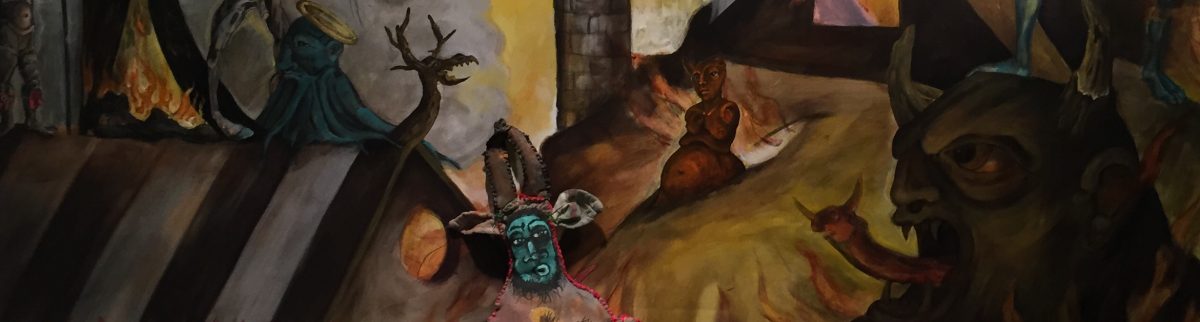
But this semester I am focusing upon relief printing. A current obsession happens to be two fauns from a nearly completed painting The Temptation of St. Anthony in the Desert. The fauns play a supporting role but they charm me for personal reasons, I can certainly relate to the older faun, confused but still obviously vital, he just needs a bit of guidance.
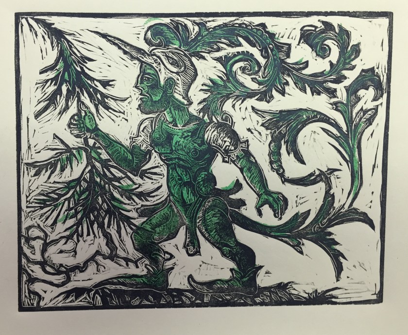
I was determined to translate these two fauns into a relief print, but the process has been complicated. I first tried conventional black ink, handsome enough but did not capture the tension I was after.
 Eruption
artist’s proof, relief print
My instructor suggested what he calls a rainbow roll- a two/three color roll of ink. I was not at all happy with this, might very well have to do with my aversion of rainbow rolls in general. Too Haight Ashbury in my snotty opinion.
 Eruption
artist’s proof, “rainbow roll” relief print
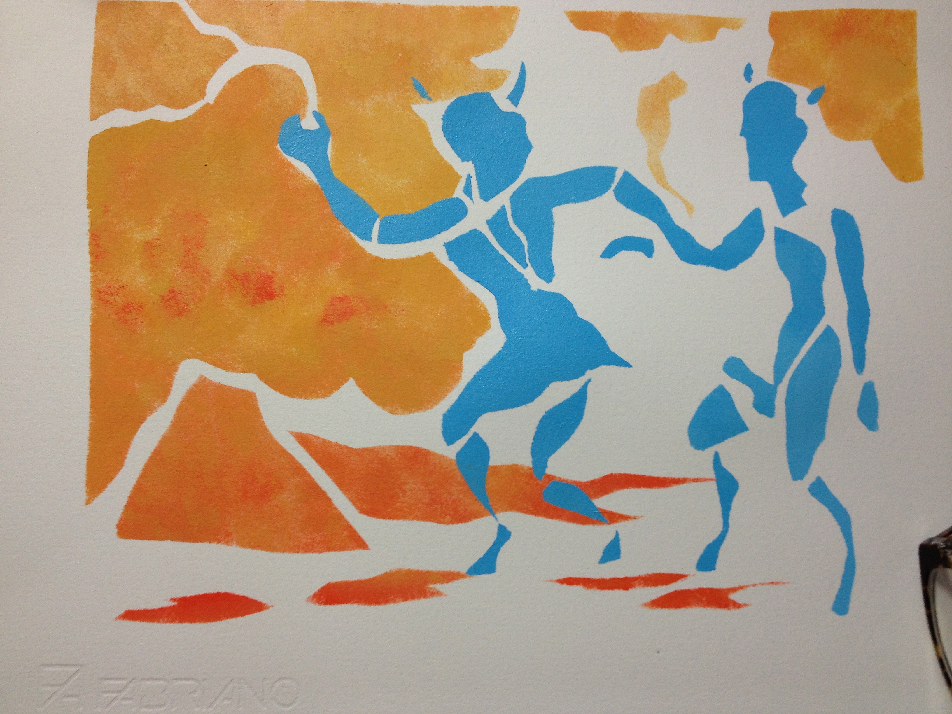
I was after spots of color, that attracted the eye to the characters and to the situation. I did not want a hand colored, water color feeling; I wanted opaque blocks of color. Clive Hicks-Jenkins suggested the stenciling method pochoir. Initially I hesitated, I explained to Clive how orthodox my instructor can be, stenciling would not suffice.
Clive assured me that pochoir was an established and well respected practice some of the most revered artist have used the technique to great effect. Risking my instructors disapproval I gave it a shot.
I am very happy I did, thank you Clive!
As I was working with two colors, I made two stencils, first orangish-yellow, applying opaque acrylic paint rather lavishly. I like how I was able to manipulate the colors, something that isn’t very easy to do with a roller. Not a “pure’ printmaking technique, but ultimately visually satisfying.
 I tackled the second color with a second stencil cut from conventional stencil paper. I t handles so nicely and reminded me of my decorative painting days. One never knows how old tricks can be applied in a new fashion.
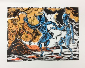
 The final step was to apply a black print over the treated paper; using a carefully aligned template made the process a breeze.
I am happy to say my instructor was delighted, he noted registration had gone awry- something I sincerely enjoy in this print- but otherwise he was quite pleased. He can take comfort in the fact that our class “Bible”, Fritz Eichenberg’s monumental The Art of the Print, Masterpieces, History, Techniques (Abrams), seems to fully embrace the technique, echoing Clive’s endorsement. So I now have another technique quasi mastered, aside from multiple color blocks ( and the odious technique of reduction relief).
Happy Clive spoke up. The final print though visibly its own statement is indeed in dialogue with its source, the randy little blue fauns from my St. Anthony.

detail of blue fauns, The Temptation of St.Anthony in the Desert,unfinished
Semester ends soon and I will at last be able to return to painting. but for now I have several unfinished printing projects which seem promising. I will post my progress in class as I finish up the projects.
Until that time, take care and much gratitude to Clive, our modern master,
LG