Fairyland, signed, sealed, delivered.

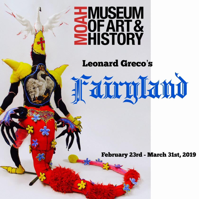
A year and a half in the making and now Fairyland is in place, ready for its unveiling this Saturday, February 23rd, 2019.

https://www.lancastermoah.org/cedar-exhibitions

Prior to delivery, my workshop was quite a mess.


(images courtesy of Shoebox PR)

But with careful planning and ample experience in moving, the packing up of the work went surprisingly well. I even took satisfaction in the neat and tidy cardboard packages, labeled like so many Christmas packages under the tree.

For all my control-freak fretting the museum staff was incredibly capable and supportive, in the transport and in the installation. I fret and fret and all goes well,so much  angst for naught.


“Embodied” in process of installation.

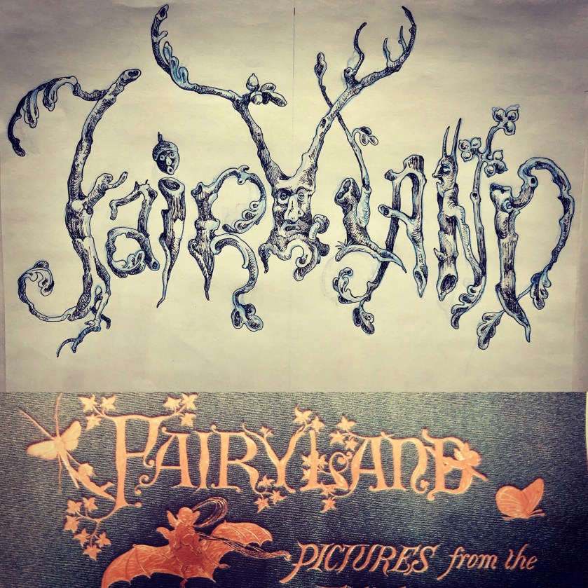
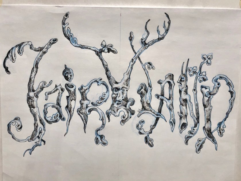
An unforeseen drama was the vinyl lettering, the custom font I had designed and posted previously was simply too complex a design to be printed by my printer.

A last minute revision was made with happy results.

Best laid plans…

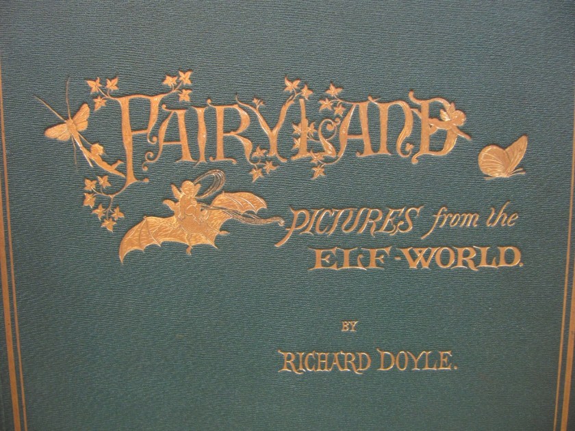
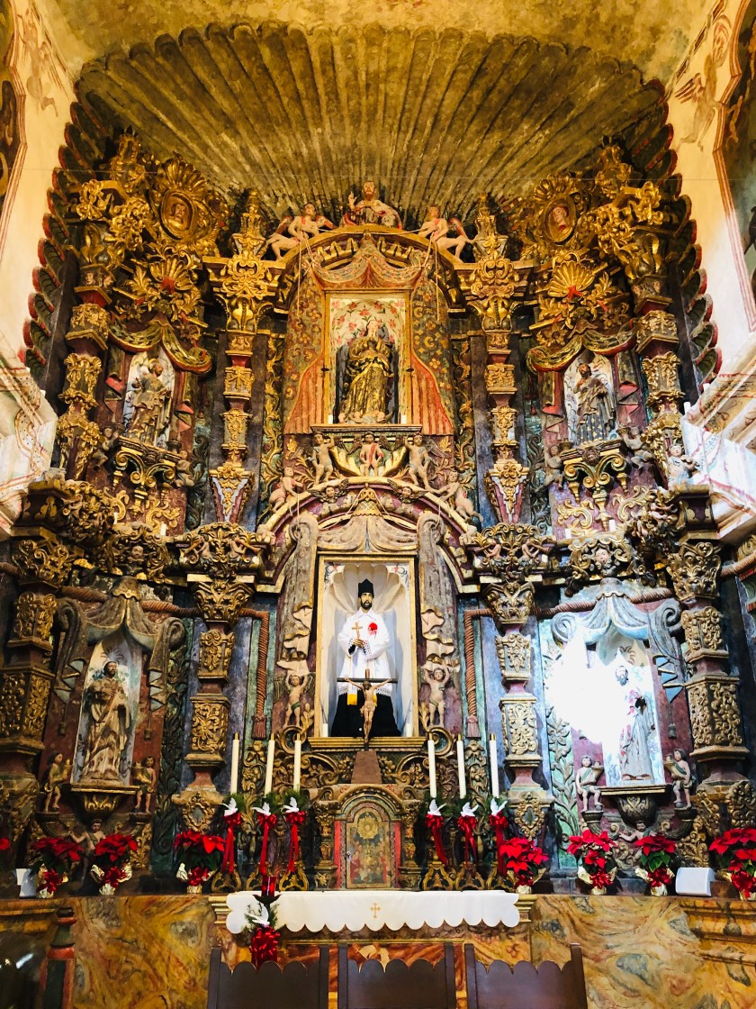
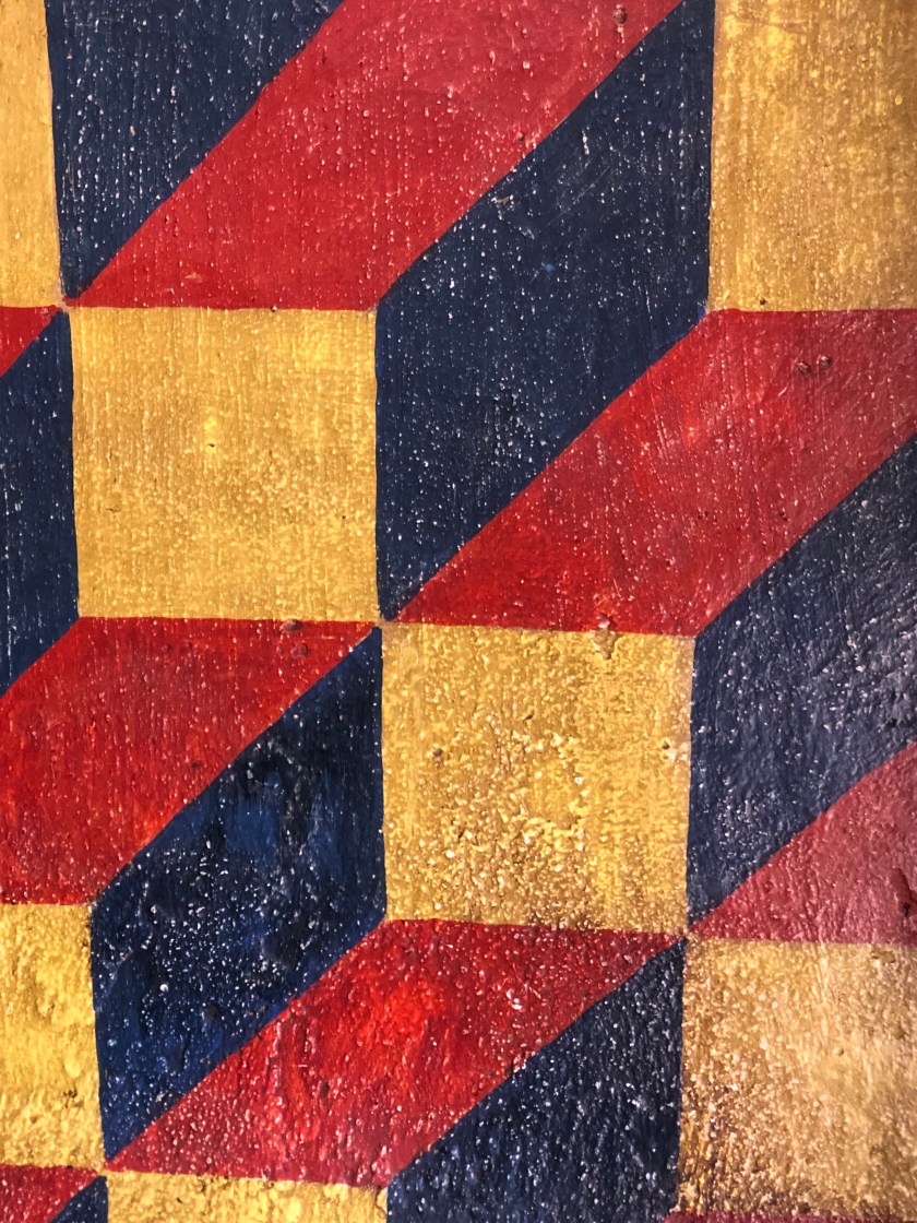
One of the dramatic transformations has been reimagining the white box gallery space into a personal place of enchantment. I specifically chose rich colors as an antidote to the “good taste” of so many gallery spaces, the blinding white or tepid neutrals . I wanted to use colors that I have lived with all my life, the blue seen above , a “Williamsburg” blue favored by my mother, that is now the wall color in my guest bathroom. The golden walls dense and theatrical evoke an orientalist fantasy and the deep red is beguilingly called Cochineal-how does one resist? I also wanted to play up the primary colors, the workhorse of a painter’s workshop and the nursery of fairy tale loving children.

So from chilling white …

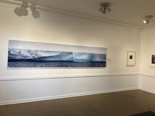
…to something more personally gratifying, and since nearly all of my paintings have Paynes Grey in them , they look pretty spiffy.


To say it has been harrowing is an exaggeration but it has involved a great deal of planning to get this show on the road, in place and now installed. So much of my time and energy has been devoted to this project that I now feel myself bereft of purpose.  I feel such a loss, my studio is forlorn, stripped bare of my stuffed friends and my favorite paintings, a wet LA winter has left the workshop bone-chilling cold, I am feeling unable to focus on the simplest tasks. I intend to read a new translation of The Odyssey and instead binge on H.R. Puffinstuff (which I now feel has been a  latent influence , unbeknownst to me previously-also it celebrates its fiftieth anniversary this year). But for the most part I feel like a ghost, wandering lost, awaiting the next project. I know something will emerge, if nothing else I will set new tasks for myself. I am moving out of the workshop to something climate controlled, clean and with pretty views of LA, plus my husband will be my suite mate. But I haven’t any new real deadlines aside from the final , existential deadline of mortality…that always keeps me moving.

If in Southern California please try to catch Fairyland, it runs through March 31st.


Fanciful Fonts for Fairyland

As I countdown to my Fairyland opening February 23rd I have been working on marketing projects . Postcard being my anachronistic focus . While social media invitations and digital marketing will be made by my publicist, I have a deep fondness for paper ephemera.

In designing the postcards I found I needed a font for the word Fairyland. The fonts that seemed vaguely suitable were of that whimsical nostalgic mid- century sort – the sort of things that make me cringe . The Black Forest , Olde World, “Gothick” fonts seemed silly and a bit too Renaissance Fair(e).

At a loss I then recalled my hero , the Victorian illustrator Richard Doyle who in 1870 had published his own Fairyland. I knew he had designed the cover himself, I have always admired that, his insistence upon visual continuity, in fact his Fairyland is in some ways an inspiration for my own . So with his example in mind , I decided to design one myself.

While Doyle’s is adorable and sweet and my own gnarled and encrusted, I feel kinship between the two.

(The bat being perfect .)

In researching fairies and fairyland themes , I turned to late 19th century sources which seemed obsessed with the theme . As this charming cover attests , even dour science could be sprinkled with fairy dust .

My own fairies aren’t as innocent perhaps but I think just as cute.

( note the tedious font )

In addition to Doyle’s wonderful art , work that I’ve enjoyed since boyhood, another childish delight has been the illustrations of the D’Aulaires. Frequently whimsical but never silly their book art has long been a favorites day an inspiration . Their Trolls had particularly enchanting title font , it is a wonderful book , full of creepy , funny , stupid , hilarious trolls ( and comely humans ).

The inspiration has been broad and wide , from medieval illumination, to Victorian book art; I’ve had much to admire . In the end I’m satisfied with my own lettering , I may either have it translated into vinyl lettering or if time allows paint it directly upon the gallery walls myself .

With that , welcome to Fairyland.

Flower Power

Detail : The Herakles Tapestry
Image: Ken Moffatt

Given that it is a new year, why not start it off with something delightful.

Flowers fit that bill perfectly. I’m obsessed with flowers: in my home, multiple bouquets are generally scattered about, I’m seemingly unable to pick upholstery fabric without selecting a floral chintz or needlepoint, and of course the garden. But it is in my studio that florals frequently make their strongest appearance. I’m drawn to the seeming disharmony between  the floral and the fine arts. I delight in challenging the dismissal of  floral and vegetal motifs to the decorative arts .

I’m also interested in  refuting the gendering of the floral, this feminizing of floral motifs leads to an insidious  misogynistic homophobic  mindset.  One I experience externally by society at large and  more disturbingly, internally- I am often embarrassed by my affection for the “feminine”, this post a testament to that discomfort.  It frequently seems serious art cannot be floral or possess prettiness, and yet I am very serious about my work and floral patterns and motifs bud abundantly-it is in this fact, that my work is perhaps most “queer”.  It is the incongruity  between  the floral prettiness of my work and some of its  disquieting aspects that I am drawn to in the first place.  My desire is to challenge this bias, both externally and internally.

My latest painting, a large unbound “tapestry”canvas embodies this gendered split. It is of a repentant, tearful Herakles, far removed from the bravado chest thumping posture in which he is usually depicted. This is of the post mad Herakles, after the wife slaying, after the brutal slaying of his own children, the broken man seeking redemption , rived with grief. Ostensibly the Twelve Labors were to be his redemption, but tradition maintains that  the modest hellebore is what cured his madness.

Again the flower.


The Herakles Tapestry
2018
acrylic on canvas, embroidery floss
99 by 55 inches
Image:Ken Moffatt 


Notebook sketches of Helleborus.


 The other day I approached a restroom at a restaurant and encountered this very gendered placard- it made me chuckle as the establishment was earnestly trying to be progressive yet did so in a rather gendered binary way.


If I were choose I would certainly choose the floral.


That aside, this  latest tapestry/painting is part of consistent floral motif throughout my Fairyland body of work (and I imagine will continue for quite some time) and until Fairyland is installed I will be snipping and sewing away on many elements, but perhaps most especially, flowers.

Floral garland
Recycled fabric, embroidery floss, poly-fil
Flowers, recycled rainslickers, IKEA bags,. embroidery floss, poly-fil

Of the gendering of “women’s work”, be it embroidery, stitchery, floral motifs etc, The Subversive Stitch is a wonderful examination.


My supplies shelves are crammed with vintage floral patterns from my boyhood-essentially the patterns I was denied as a little gay boy.

But I’ve made up for lost time. With that, happy 2019!

Detail : The Herakles Tapestry
Image: Ken Moffatt

Mission San Xavier del Bac: Art and Faith

As a boy I looked upward towards the sumptuous ceiling of Immaculate Conception Church , my father’s parish church in the Italian American community of Trenton NJ. I was moved beyond belief , the incense became more aromatic , the songbook more inspiring, the gospel readings more personally encouraging.

Today upon entering the desert church of the Mission San Xavier in Tucson Arizona, I felt that familiar tingle of faith synchronized with art creating an exhilarating sensation. My Catholicism is intertwined with my art making and with my life . At times , foolishly, I’ve tried to distance myself from my faith , but the saints , they come a knocking and will not be ignored .

Inside this treasure of a church , my iPhone clicking away in the most secular vulgar fashion I looked about at the faithful reciting their rosary , the earnest supplication for divine intercession and the pinning of milagros upon the reliquary of the mission’s patron and I felt a sense of shame , of coarseness. Amidst such sincerity , my appreciation for the art clouded the balm my soul was being offered .

Silencing my phone , I sat upon the wooden pews and allowed the spirit of the place , one enriched by countless testaments of faith , to sink in .

The following images were taken before the intercession of spirit .


Below, the central altar .

La Dolorosa, circa 1750, east transept


Jesús Nazareno, west transept

I admire the rich and exuberant ornament surrounding this santo.

Elsewhere art abounds.

One of an angelic pair flanking the main altar.

The fonts shaped as shells I believe , notice the diapered wainscot.

How sweet is this angel ? One of many charmingly depicted.

As you can see below and in other images this is an active church , faith engaged daily , in this case festively for the celebration of our Savior’s birth .

The baptismal font curious and marvelous.


The choir loft equally enchanting.

As is so often the case , this mission’s dazzling interiors are enhanced by austere splendor of the exterior , the sunlit majesty of this mission is incredibly inspiring .

There was a side chapel , I don’t know it’s history , I’m , we’re , now reading histories of the place to be better acquainted for future visits , but we both were moved to tears by the power of the place . The passionate pleas laid bare in this modest sanctuary. No inkling present to document this sacred hallowed ground by pulling out my phone , so instead this side altar to my patron saint must suffice .

With that , I sign off.

Pax.

Pluton

My latest stuffed painting , just a small element of my installation piece Embodied: St.Anthony & the Desert of Tears, a reimagining of Flaubert’s masterpiece The Temptation of Saint Anthony.

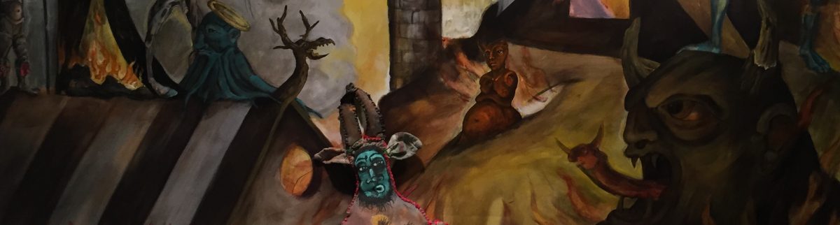
Pluton, Prince of Fire and Governor of the Region in Flames

2018

31 inches high by 31 inches wide by 24 inches deep

Mixed media : recycled fabric, acrylic paint , embroidery floss, poly-fil, vintage footstool


Pluton and his infernal pals will be introduced February 23rd 2019 at the opening of my Fairyland solo show at MOAH/Cedar, Lancaster, California.

Would love to see you there . The show runs until March 31st 2019.